Ôrker
A new way of designing life insurance
The Project
Client
Ôrker
Location
Brazil
What did I do?
Brand Design
Brand Strategy
Design System
Visual Design
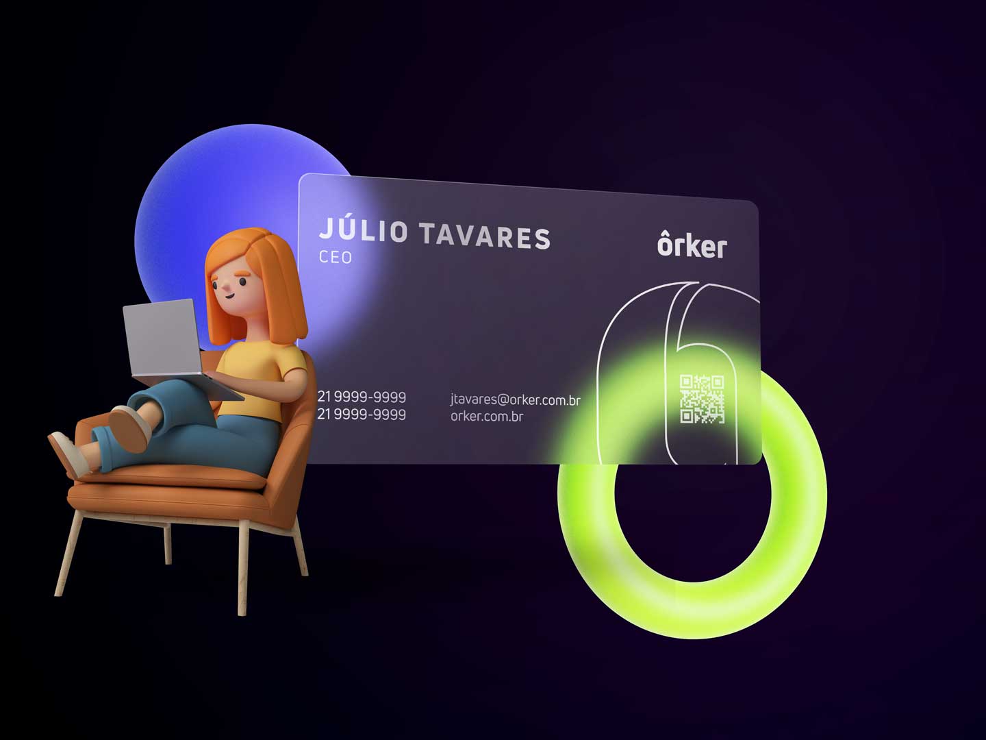
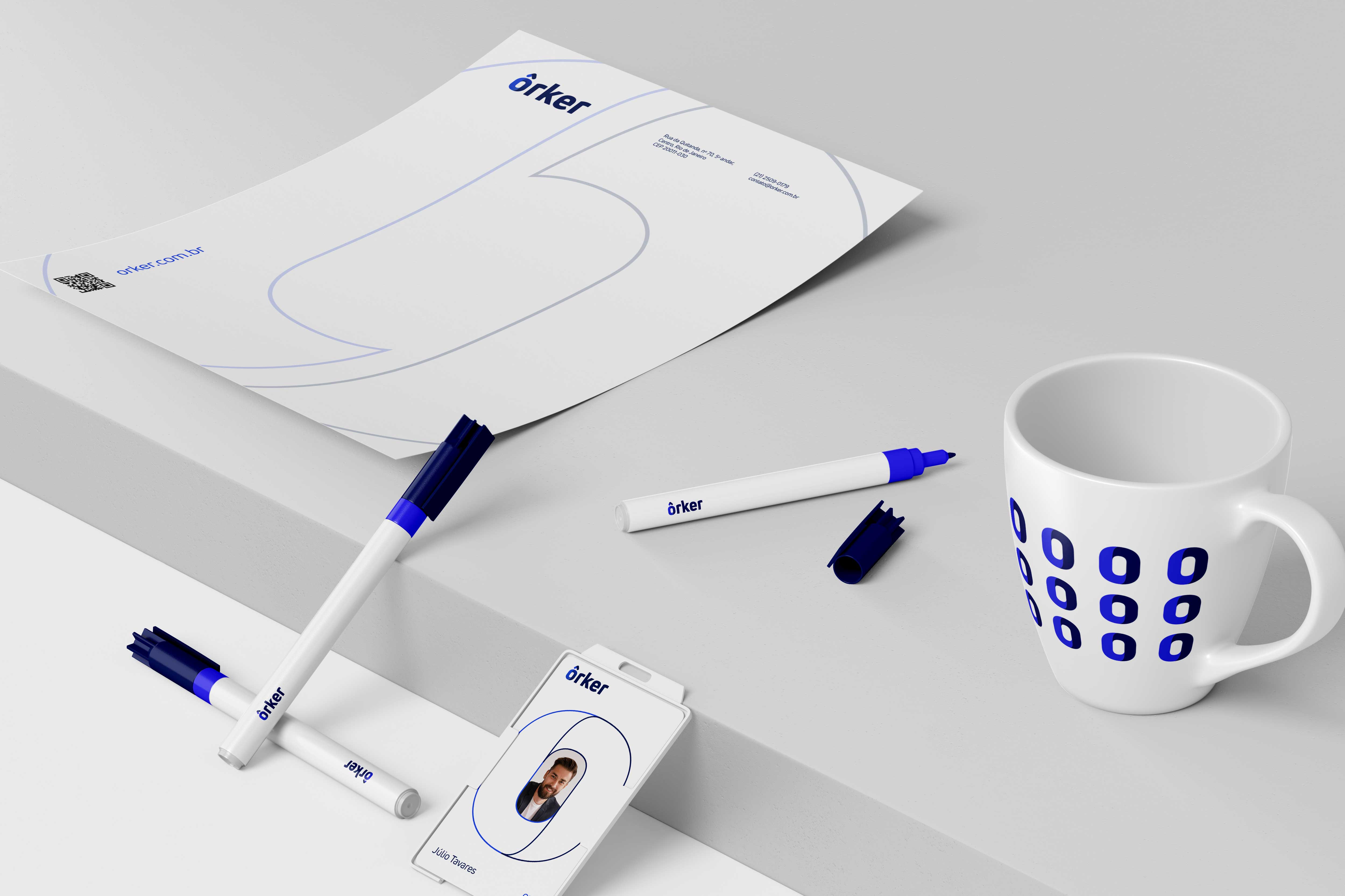
Logo + Visual identity
Social Media Design
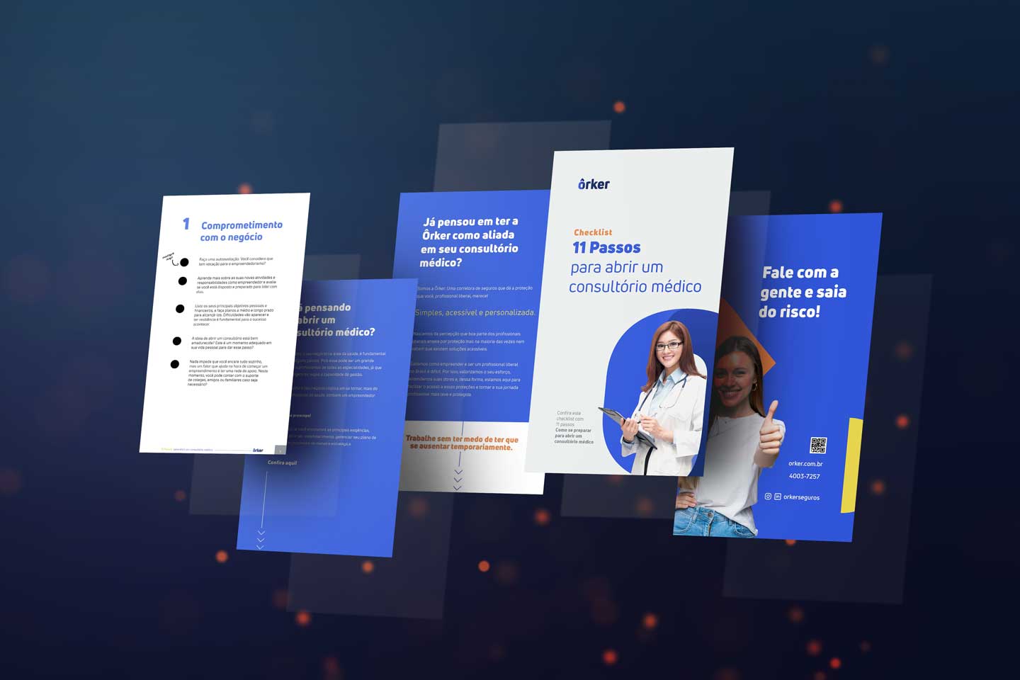
Print & Online Design
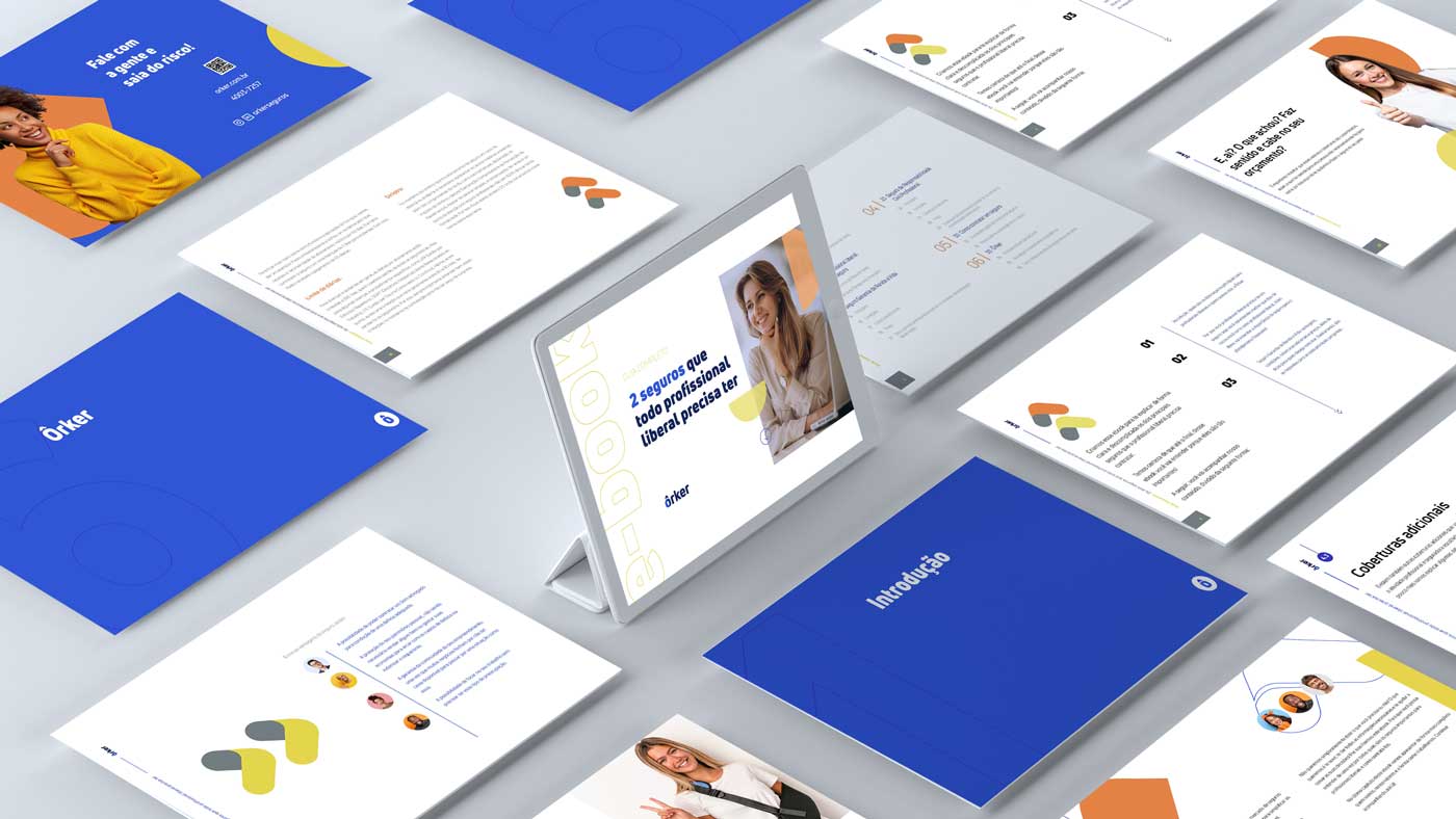
Ebooks
Visual elements and assets creation
Brand Strategy
Design System
Visual Design
Logo + Visual identity
Social Media Design
Print & Online Design
Ebooks
Visual elements and assets creation
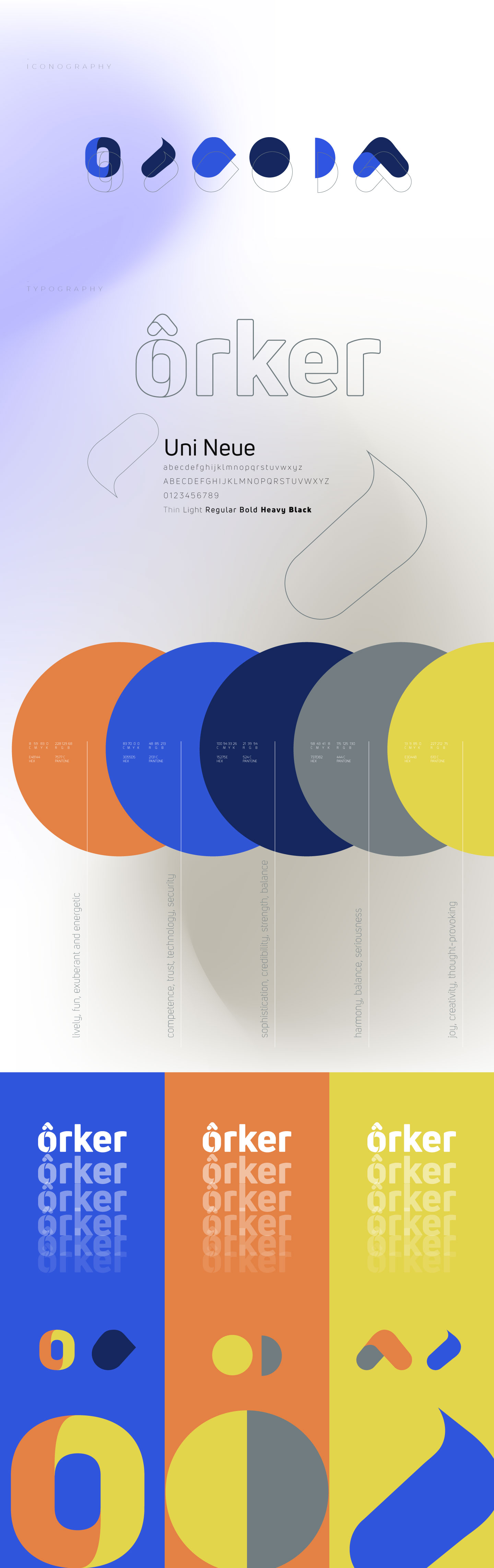
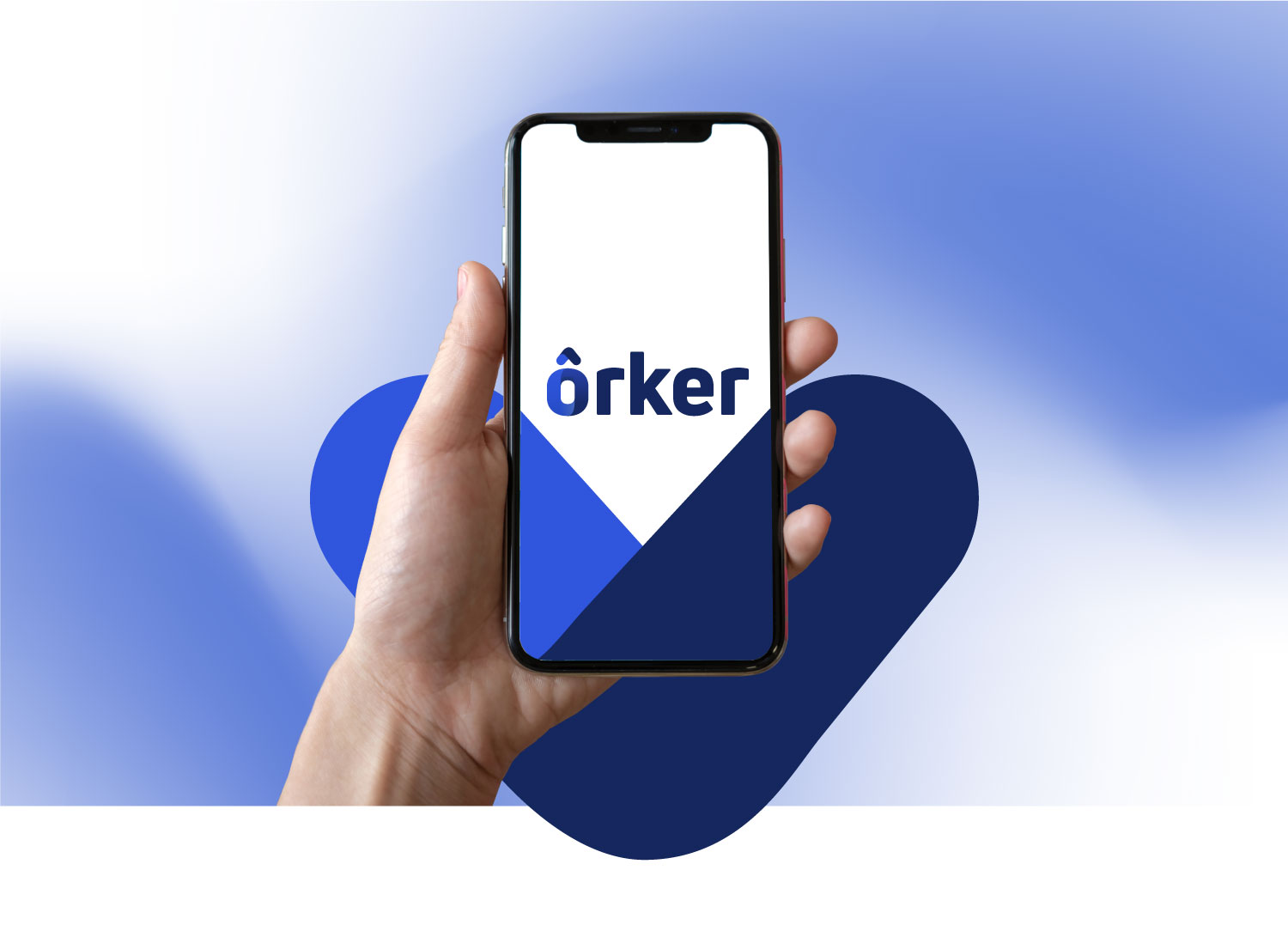
Meeting needs, commitment to care, a close and contemporary visual language. These are the main aspects that guide the visual identity of Ôrker, a Brazilian startup company. They provide insurance solutions for the self-employed.
The rounded and fluid shapes applied to the typography reflect the brand's values that prioritize human connection, with an uncomplicated, close, useful and efficient tone of voice, capable of connecting with all professionals who seek more security in their lives. Visual identity’s main purpose is to communicate connection.
Elements that
connect with people
The circular elements give an aspect of protection, complicity and care as essential attributes of the brand.