EAITE
New Brand for Eaite
innovation in vacation rentals & tourism

The Project
Brand Strategy
Visual Design
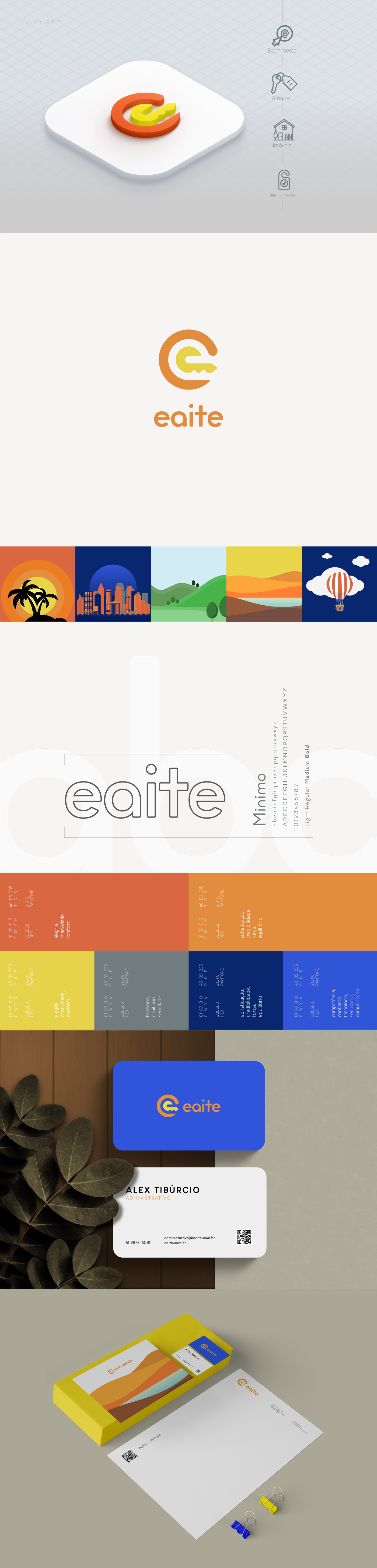
Logo + Visual identity
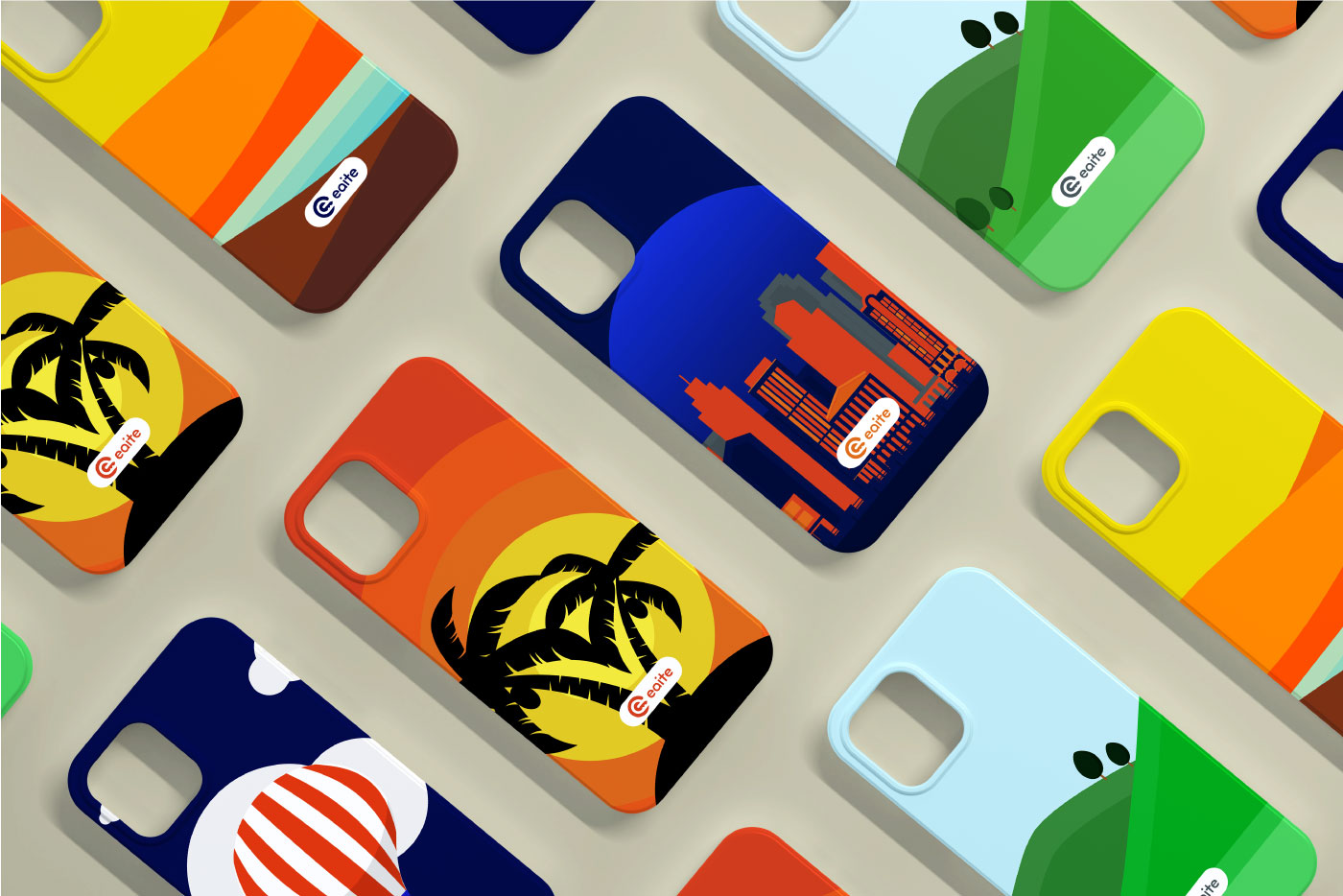
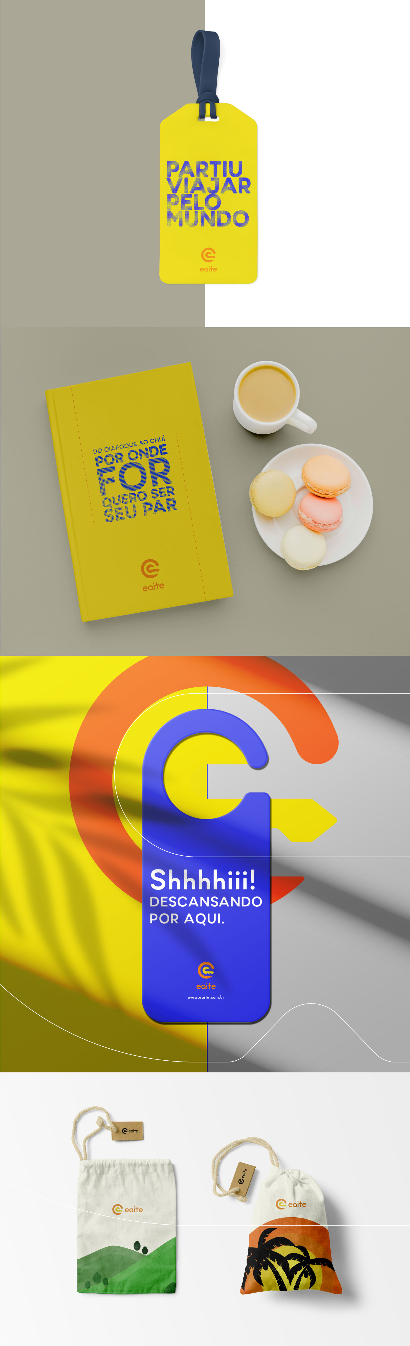
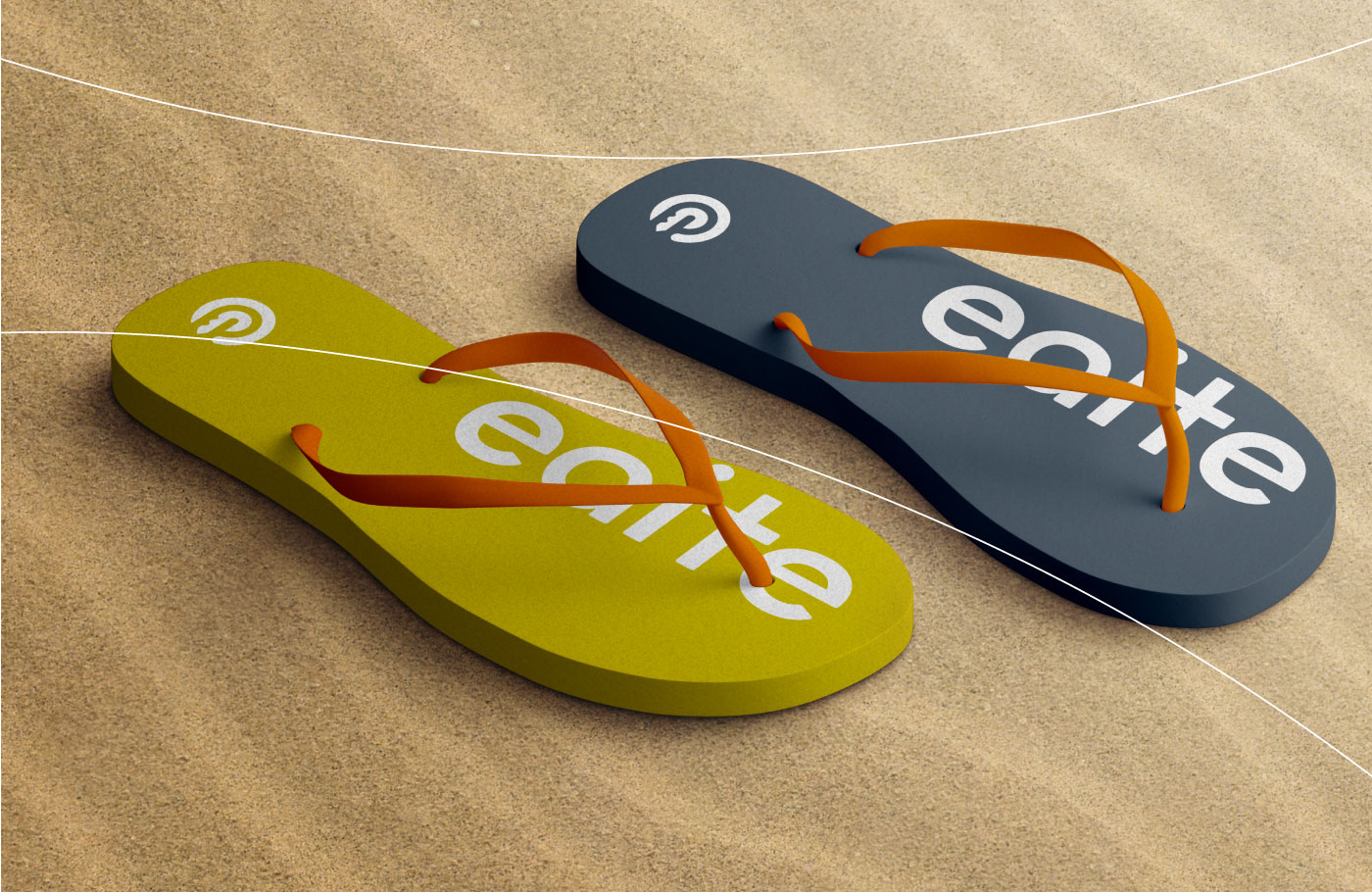
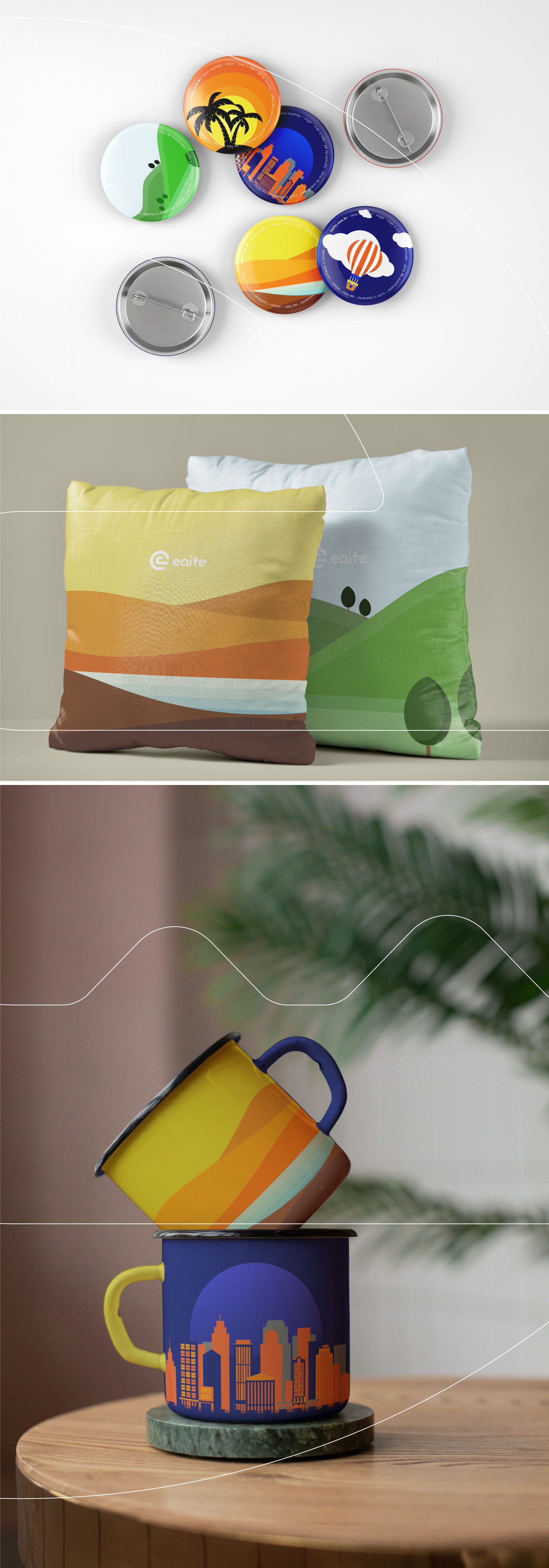
Print & Online Design
Visual elements and assets creation
EAITE is a Brazilian company that operates an online marketplace for lodging, primarily homestays for vacation rentals, and tourism activities.
The rebranding of the Eaite brand was inspired by its own name, an acronym created by the owners:
E for Ecommerce
A for Aluguel (Rent)
I for Imóveis (Properties)
Te for Temporada (Seasonal).
Based on this concept and the iconography representing each part of the name, the new symbol signs the brand with two shapes: one—a semicircle that refers to e-commerce, a digitally provided service—and the other—a key, which directly represents the rental of a property but symbolically serves as a decisive element, a piece that opens and closes a partnership, for instance. These two shapes combine to form the letter "e" for Eaite in the negative space.The typography features rounded sides, denoting a contemporary, fun, and friendly style, bringing the brand closer to its audience.